Lifewell
Brand Identity / Advertising / Social Media / Web Design / Photography
Finding Your Center
The Brief
Can skilled coaching unlock the perfect version of you?
The Opportunity

Life coach Jolene Atkinson came to FUEL with a unique challenge. She needed help transitioning from a career in psychology and counseling to one in life coaching. Family, career, financial – each of her clients would have individual goals and experiences. The trick would be to find that unifying concept that held it all together, while appealing to different ages and genders.

Brand Identity

In its essence, the logo depicts a life that is blooming and flourishing. This parallels Jolene’s efforts to help people “level up” as opposed to a practice focused on healing. To create consistency between the letter forms and graphics, the two leaves create an “L” shape while the geometry supports the notion of a centered and balanced life.

FUEL helped Jolene establish a name that strikes the connection to her life coaching business while maintaining a clear footing in health and wellness. In addition, the team helped cross reference and vet names against available URLs to ensure she’d launch with a clean, intuitive home on the web.

Lifewell domain search

As part of the creative process, FUEL designers begin with sketching. It’s an efficient way to develop great ideas and zero in on those with the most potential, as was the case with this early iteration of the Lifewell logo.

To create the building blocks for a stunning stationery system, FUEL designers used geometric elements of the logo to create a pattern that brought visual interest and texture to surfaces in a subtle way. A color gradient was used to show range and movement, akin to one’s emotions as people are dynamic beings.

Lifewell color palette
Lifewell find your center tagline and font
Lifewell gradient
Lifewell font and gradient tagline combinations

A vibrant color palette supports the idea of a flourishing life. Imagery feels authentic, personal, and positive. Bigola typeface (primary) uses ligatures to build upon the theme of growing and blooming into your authentic self, while Univers (secondary) delivers balance and stability for subheading and body copy.

Social

To help fill the feeds on social media, FUEL created a library of graphics and images for the client to pick from. This, in addition to imagery pulled in by the platforms when sharing content from Lifewell’s site, helped to establish a defined aesthetic and consistency across the presentation of the company.

Lifewell social overview on mobile
Lifewell social post on mobile

Web Design

FUEL carried the Lifewell identity to the web with a clean, approachable web design to introduce Jolene and her life coaching philosophy. The UX was optimized to drive bookings.
Lifewell web page
Lifewell web page mobile

Promotion

FUEL curated a selection of useful promotional items for Jolene to use as introductions and leave-behinds.
Lifewell promotion notebooks
Lifewell promotion pens
Lifewell promotional banners

Photography

The art direction leans on natural light and caught-in-the-moment photography to bring authenticity to all communications. This approach helped convey inner calm while furthering the sense of lives in balance. Jolene is shown in ways that demonstrate she’s approachable, personal, and willing to get up close to learn about and offer guidance to people as they work to improve their lives.

Recognition

Lifewell ADAI awards best of category
Lifewell ADAI awards excellence

Best of Category | Online / Interactive

ADAI 64th Annual Design Exhibition

Best of Category | Identity Mark

ADAI 64th Annual Design Exhibition

Excellence Award | Online/Interactive

ADAI 64th Annual Design Exhibition

Excellence Award | Identity Mark

ADAI 64th Annual Design Exhibition

Excellence Award | Integrated Brand System

ADAI 64th Annual Design Exhibition

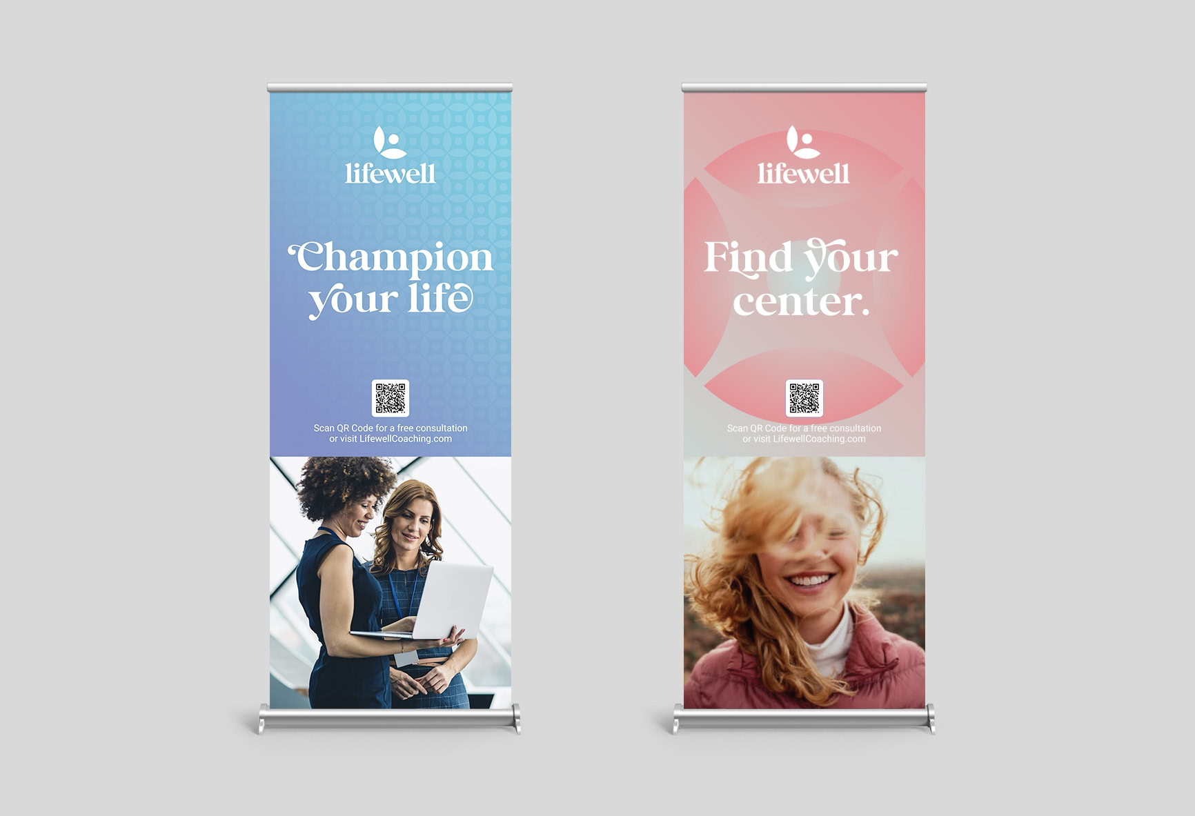
"As a new entrepreneur, there is so much to learn and FUEL has been a partner from the start. They have been my teachers around branding and online marketing. The FUEL team is incredibly approachable. This has been a business nurturing process and I am confident the team is invested in my success."
— Jolene Atkinson
Bill Bollman
Creative Director

Bill Bollman is FUEL’s Creative Director. Before co-founding FUEL in 2001, he worked for Horizon Communications, JW Morton and Basler Design Group. Bill studied Illustration at Hawkeye Tech in Waterloo, Iowa. An expert in the “old ways” of hands-on print production, these skills influence his work in the digital world to this day. His work throughout his career has been featured in international publications including Graphis, How International Design, Communication Arts, and The One Book as well as numerous design annuals and reference books.

Hometown: West Union, Iowa
Involved in Design and Marketing since 1988
Interests: Fitness, Travel, Movies