The Brief Can a cohesive brand help drive donations?
The Opportunity
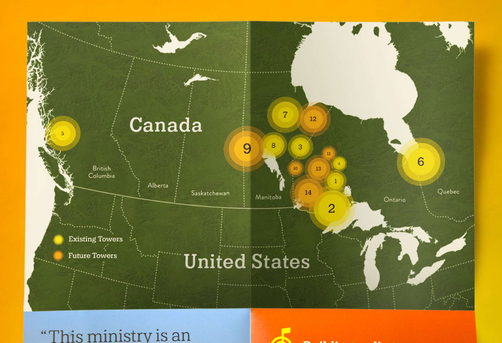
The nights are long. The winters are longer. And for some people, the feeling of isolation can be too much to bear. To counteract, Nations One is building a network of radio towers across Canada. This network delivers Gospel content by natives, for natives, to transform lives by giving a sense of community, peace, and hope. FUEL worked with this non-profit based in Duluth, Minnesota, to overhaul its branding and add immediate credibility in the eyes of prospective communities and donors alike.
Brand Strategy
FUEL assisted Nations One with naming and design of the identity. Throughout the entire process, tribal representatives were consulted to ensure the colors and forms were aligned with the culture of native peoples.
Brand Identity
Rather than moving First Nations people away from their heritage, the Nations One mark embraces it. The mark combines the familiar shapes of a tipi and radio tower with religious symbols to further invoke the client’s mission.
Brand Expression
The team landed on a color palette that’s joyful and earthy. Yellow speaks to the energy and illumination of both the sun and the Gospel, while a warm brown delivers a strong foundation that harkens back to earth tones of Northern Canada.
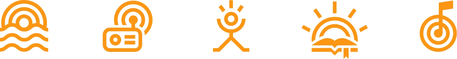
Beyond the logo, the palette was brought to life in a set of icons and illustrations custom-made for the organization.
Collateral
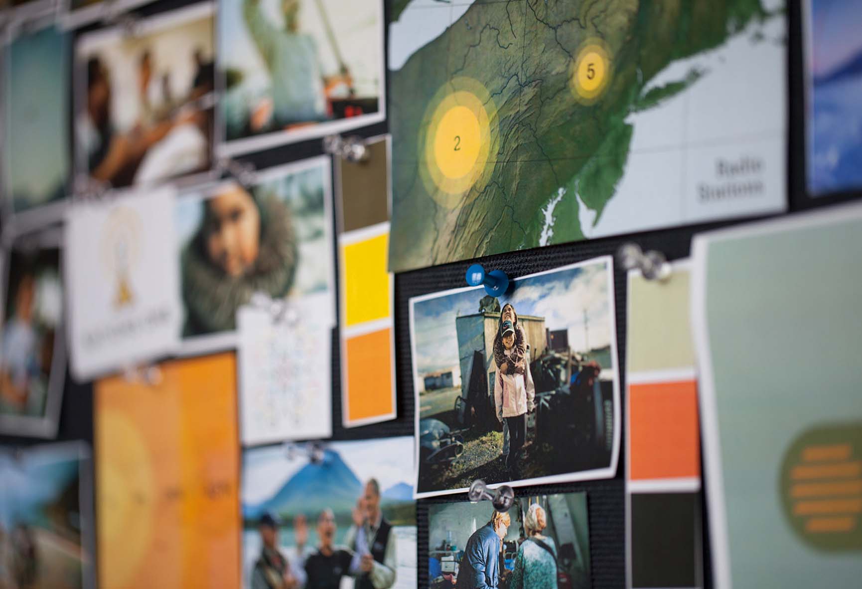
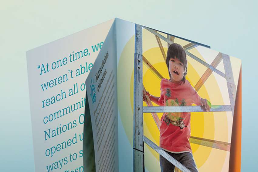
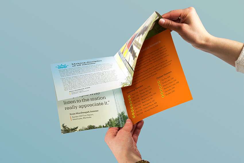
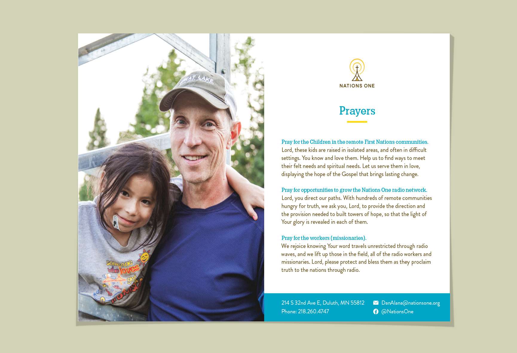
For many, a first encounter with Nations One might not be digital. To facilitate that first connection, multiple pieces of collateral were created to bring the Nations One brand to life in a more tactile and personal way. Nations One’s collateral design takes its cues from the brand’s visual and messaging strategies, inviting a closer connection. Whether fundraising or meeting a new community leader, there is an authenticity that resonates across the printed media
Bringing light and life through gospel radio.
Web Design
FUEL approached the web design by leveraging original photography and the vitality of the iconography and illustrations. The site tells the Nation One story through text and video, shows the reach of the growing network, allows guests to stream programming, and facilitates donations.
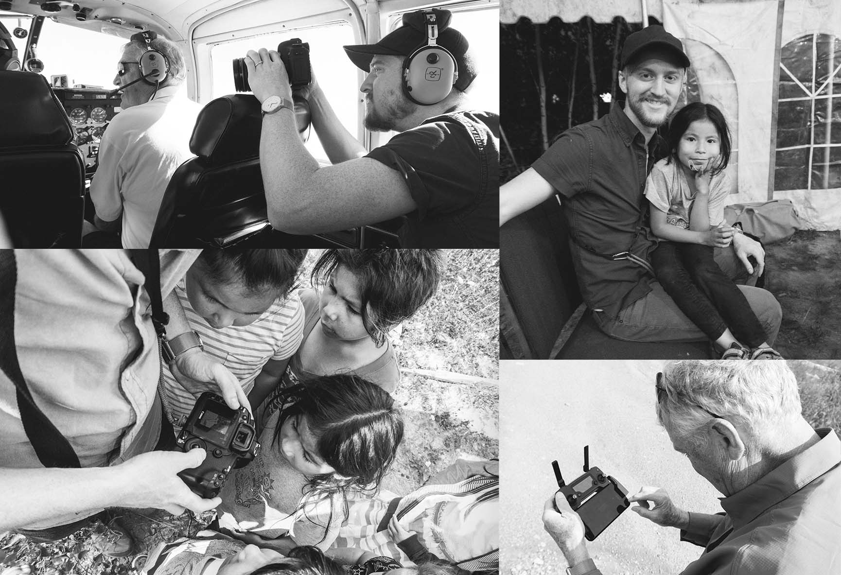
The artistic direction of the photography, shot by the FUEL team on location on tribal lands, aimed to be friendly, inviting, and authentic. Used on the website and collateral materials, these elements were integral to indicating Nation One’s credibility when raising funds to reach even more people.