Farmers Hen House is not your average egg producer. Unlike major corporations or boutique growers, it works exclusively with Amish and Mennonite farmers throughout Iowa and Missouri to provide a steady market for their eggs. The company came to FUEL with a challenge – help us fine tune our brand to keep these communities thriving in a modern economy.
Brand Strategy
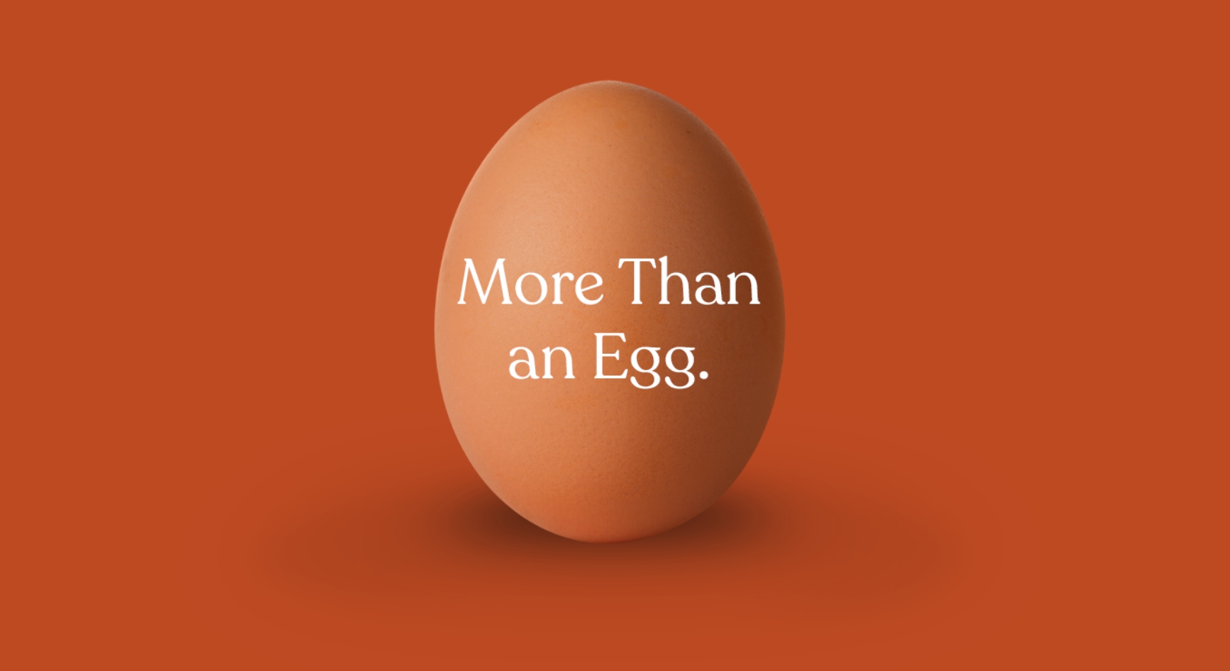
Amish and Mennonite farmers were employing organic agriculture principles long before it became a thing. Couple that with communities of farmers living traditional, faith-based lives and you get an immediate sense there’s something different going on with this brand. “More than an Egg” was born.
Logo
While the client preferred to maintain the existing logo, it agreed to allow FUEL to make some minor updates to it to improve legibility and create greater consistency with the new brand expression.
Before
After
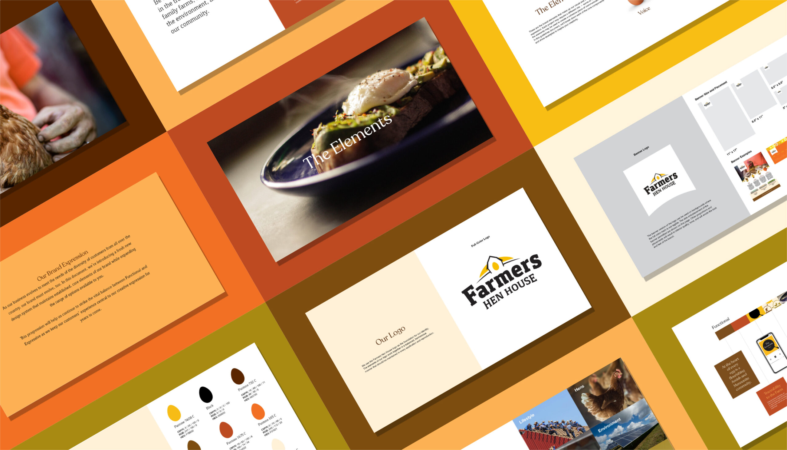
Brand Expression
Warm, earthy tones anchor the brand’s color palette. These choices picked up on colors native to the Amish/Mennonite Midwestern farmlands. Another source of inspiration? Golden egg yolks.
As a smart workaround to the limitations with photography, the brand would lean on illustration to tell more of the story. Isometric and geographic shapes draw inspiration from the traditional quilt patterns utilized in Amish/Mennonite communities.
For typography, FUEL chose Recoleta as the primary typeface due to its soft and approachable presence. Our designers also liked that it was reminiscent of an older serif and tapped into the Amish heritage, while also feeling modern and fresh.
Since Amish/Mennonite people do not always want to be photographed, we were careful to show the personality of their farmland and community while being sensitive to a desire to protect their identities. That said, FUEL paid close attention to how the photography captures authentic characteristics of these communities and their customs.
Packaging
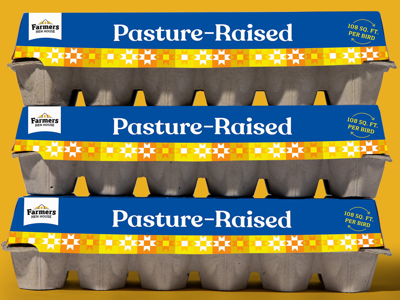
FUEL tackled the packaging design with two goals in mind: differentiation on the shelf and legibility. For differentiation, the previous packaging depicted a generic egg and there was nothing to set them apart from the other competitors vying for attention. Using illustration, we were able to tell more of that Amish and Mennonite story that is so unique to the brand.
To address legibility, the limited palette used in the illustrations enabled us to improve the font size and simplify the overall design so it would be easier to read from a distance. The use of bold and unique colors in comparison to the competitive landscape created stopping power and helped the Farmers Hen House cartons stand apart from competitors.
Web Design
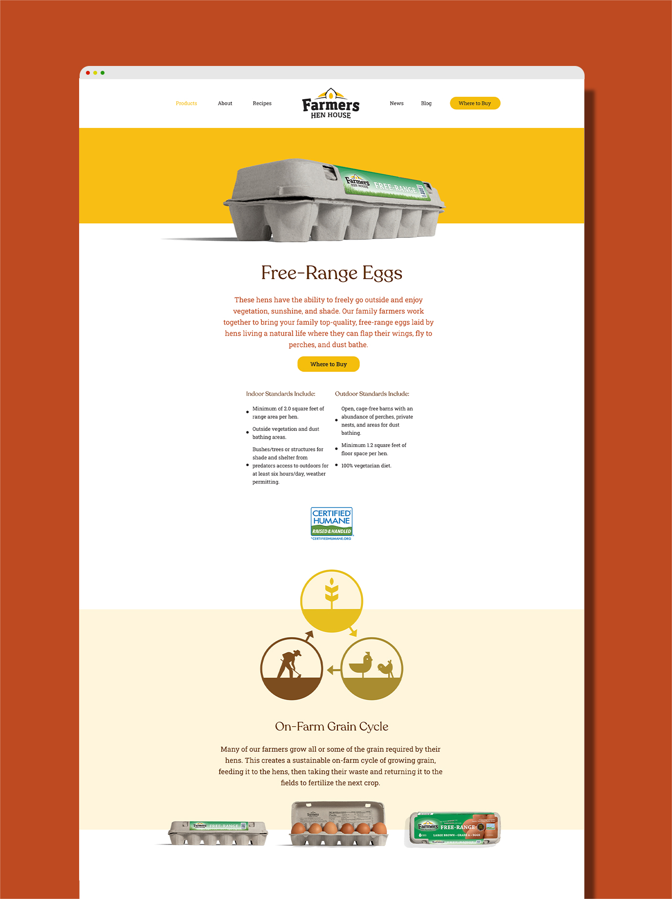
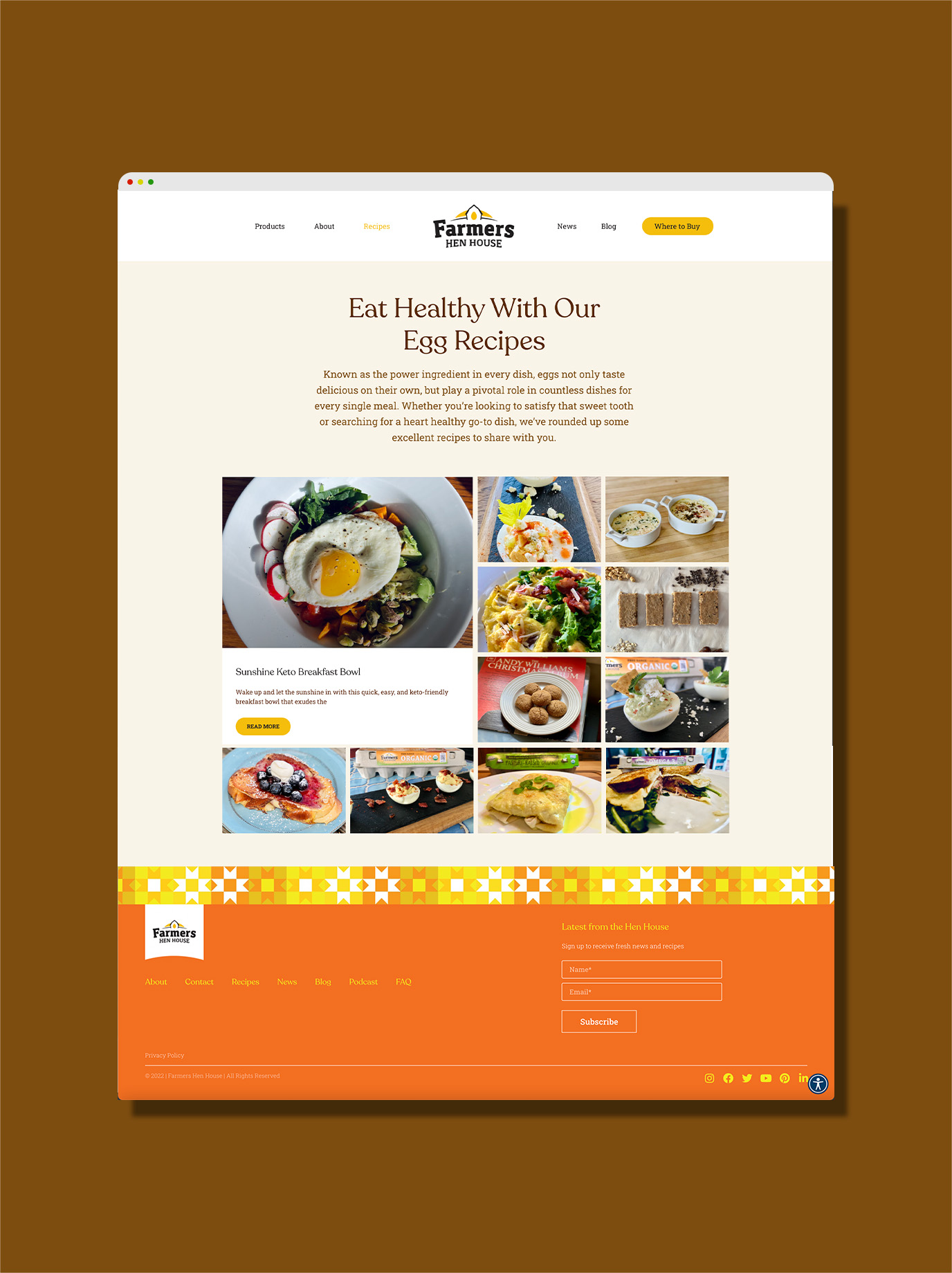
Aesthetically, the site brought the new branding to life while providing key additions for users. An intuitive UX made it easy for guests to take deeper dives into the company’s purpose, the founder’s story, and sustainability initiatives. Adding utility such as Where to Buy functionality powered by Destini™, simple touches like quick links to prominent retailers and shopping apps, and a library of tasty recipes elevated the experience.
Look and feel aside, every site in the consumer packaged goods space starts with a keen eye for SEO. FUEL’s attention to detail helped Farmers Hen House solidify its ranking in priority keywords.
Advertising
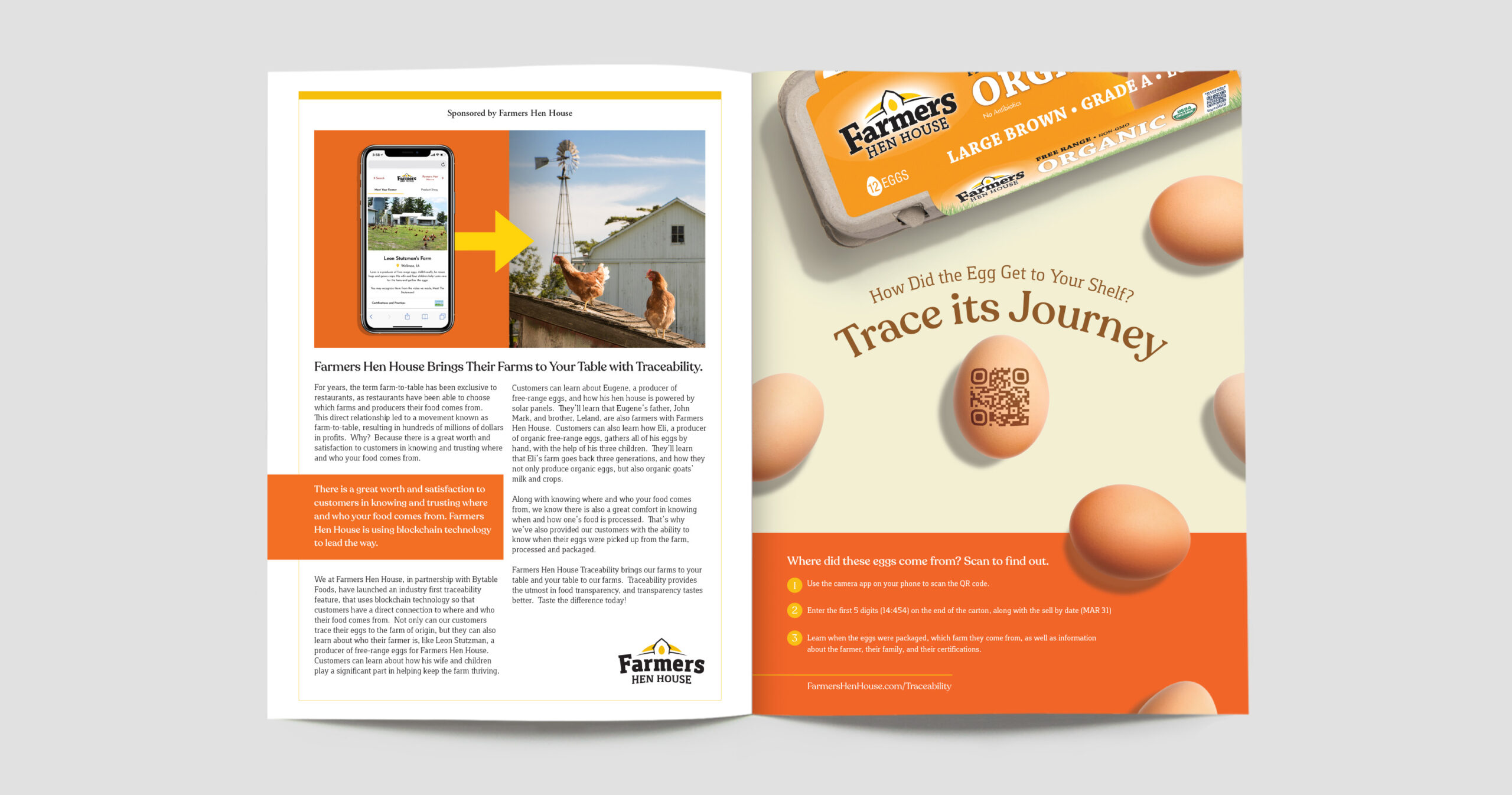
FUEL helped Farmers Hen House carry the branding to its trade advertising. As more people become eager to know where their food comes from, the company set itself apart by utilizing block chain technology in its supply chain to trace each carton of eggs back to the farm it was sourced from. This created an interactive opportunity to introduce the family that harvested the eggs to the people that purchased them.
“FUEL has been responsive to our needs. They have displayed a personal touch and flexibility to what we need along with taking time to understand our business.”