Packaging / Photography / Point of Sale / Video / Commemorative / Web Design
Better With Age
The Brief Can consistency help a maturing whiskey brand to the next step?
The Opportunity
From the first distillery to open in Iowa since Prohibition, Master Distiller Jeff Quint uses a grain-to-glass approach including locally sourced corn. The packaging has always reflected a small batch, home-grown feel to ensure the premium, hand-crafted whiskeys command attention. But after earning top honors in a pair of premier competitions, Cedar Ridge’s reputation grew and distribution followed. The time had come to evolve the look to be more reflective of a mature distillery backed by a team working at the height of its powers.
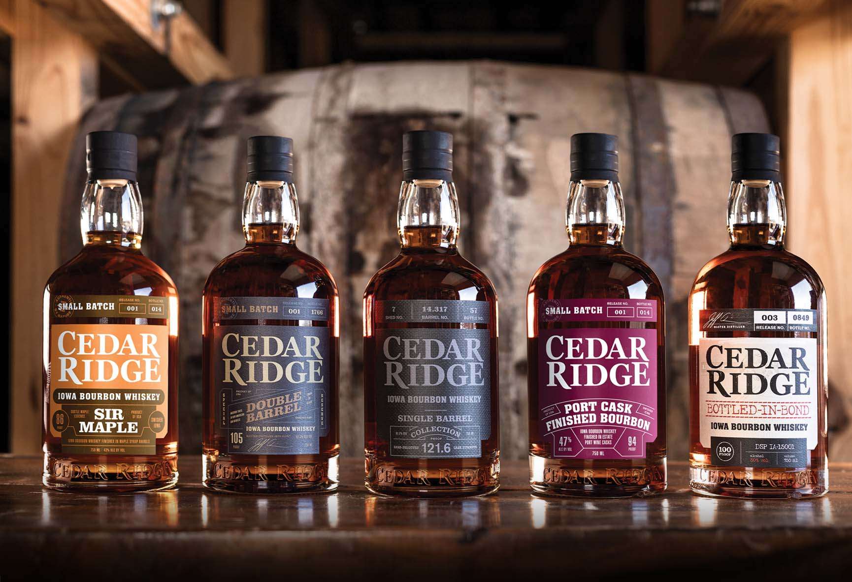
Packaging
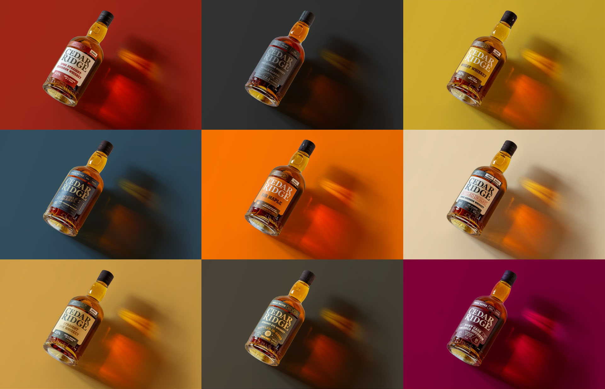
As part of a packaging refresh, FUEL developed a label system for the family of Cedar Ridge whiskey to ensure the line continues to grow. The color palette played a big part to help distinguish each SKU, along with embellished line art to house typography. To maintain connection to the original bottle, the design team retained the tape on top.
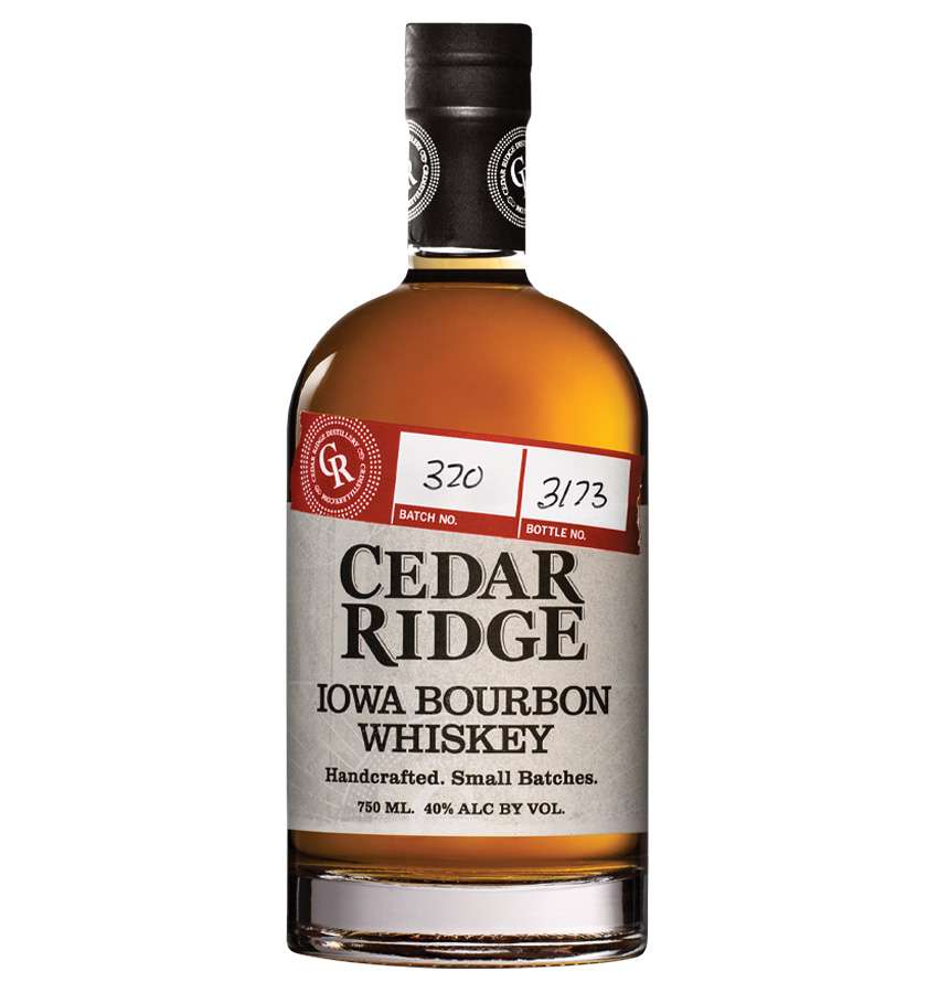
Before
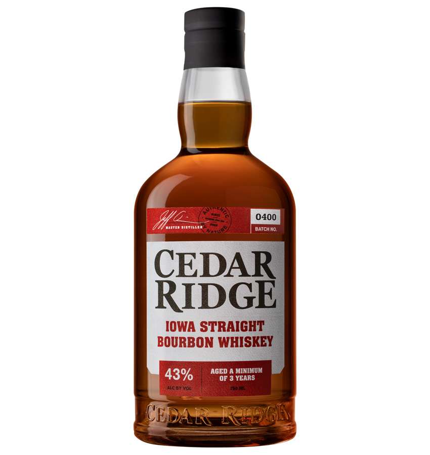
After
Special times call for special editions. FUEL helped Cedar Ridge design a commemorative 4th of July label to celebrate The Heartland’s Bourbon.
Photography
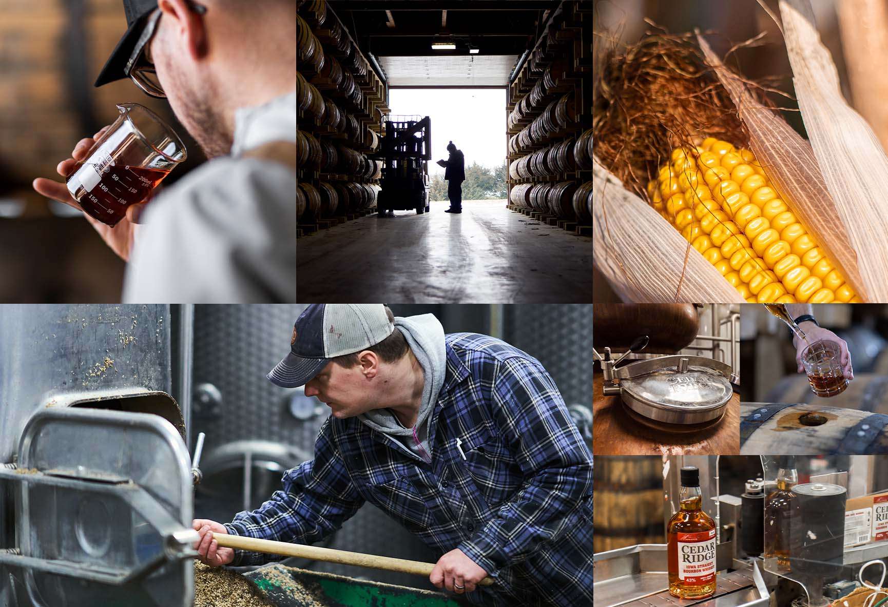
Refined photography was shot in environments around the distillery to further the authenticity of the brand and its place in the spectrum of premium whiskeys. In short, this is tasty, high-quality liquor.
Beyond bottle shots, art direction leveraged lifestyle photography aimed at drawing attention to the people, place and process that make Cedar Ridge distinct.
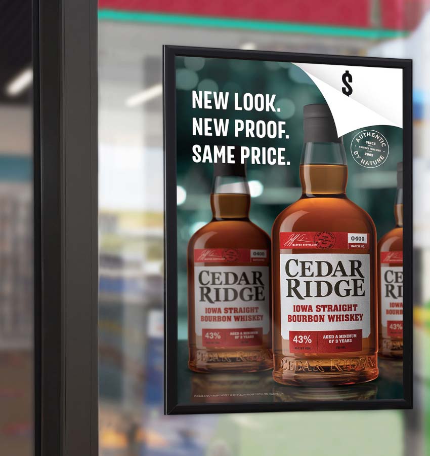
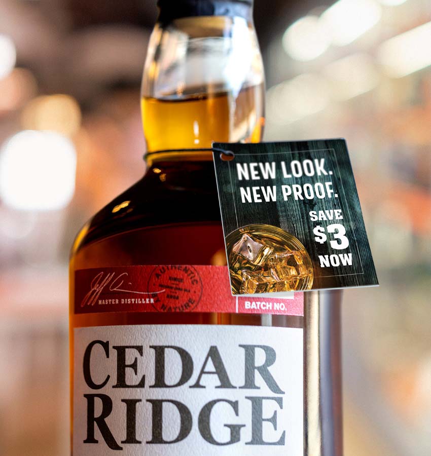
Point of Sale
In-store materials emphasized the shift in the look of the bottle and label to connect the dots for devotees while still attracting new converts.
Video
Featured on the site, the lead-in video showcases the conceptual process for the glass and label.
Web Design
To help the distillery grow its presence within the Cedar Ridge portfolio, FUEL developed a site featuring just the whiskeys and spirits. The web design took a layered approach to featuring the flagship Iowa Bourbon while giving other spirits and special editions their due.