Brand Identity / Brand Expression / Advertising / Social Media / Web Design / Photography
Clarity in Communication
The Brief Can design drive better patient care?
The Opportunity
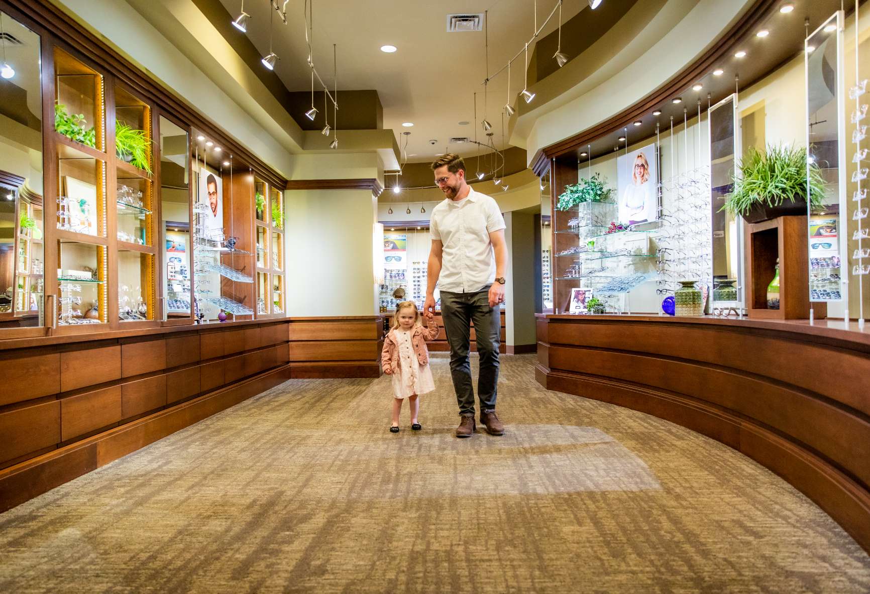
Blink Vision by Veatch is an optometry practice in North Liberty. It has built a reputation for proactive eye health, expert vision care, and exemplary customer service. Dr. Veatch and his team came to FUEL looking for a partner who could realign their visual branding and expression to be more reflective of the delightful patient experience and take their practice to the next level.
Brand Identity
With some minor adjustments, FUEL brought clarity and balance to the original logo in a way that offered greater flexibility moving forward.
Before
After
Brand Expression
The brand refresh began by revisiting a drab set of colors that was not true to the spirit of Blink’s staff. Crisp whites, blues and greens were used to infuse vitality both in store and online.
Before
After
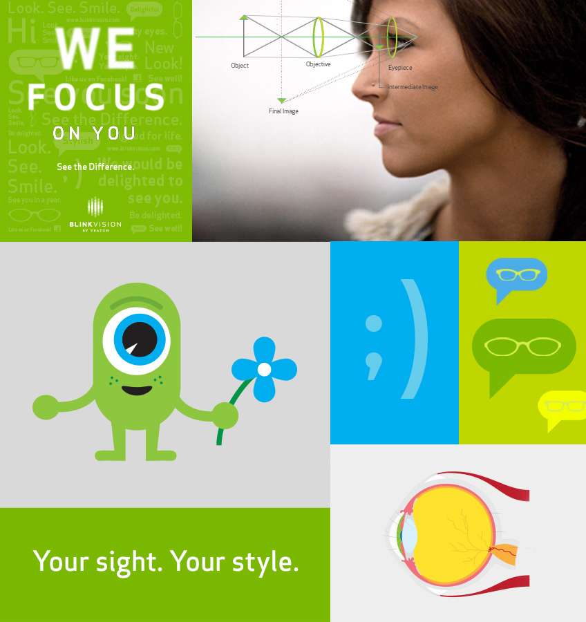
Graphically, FUEL used a blend of photography, typography, and illustration to not only inform, but to convey approachability throughout the patient experience.
A Different Kind
of Eye Care.
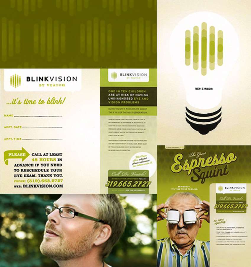
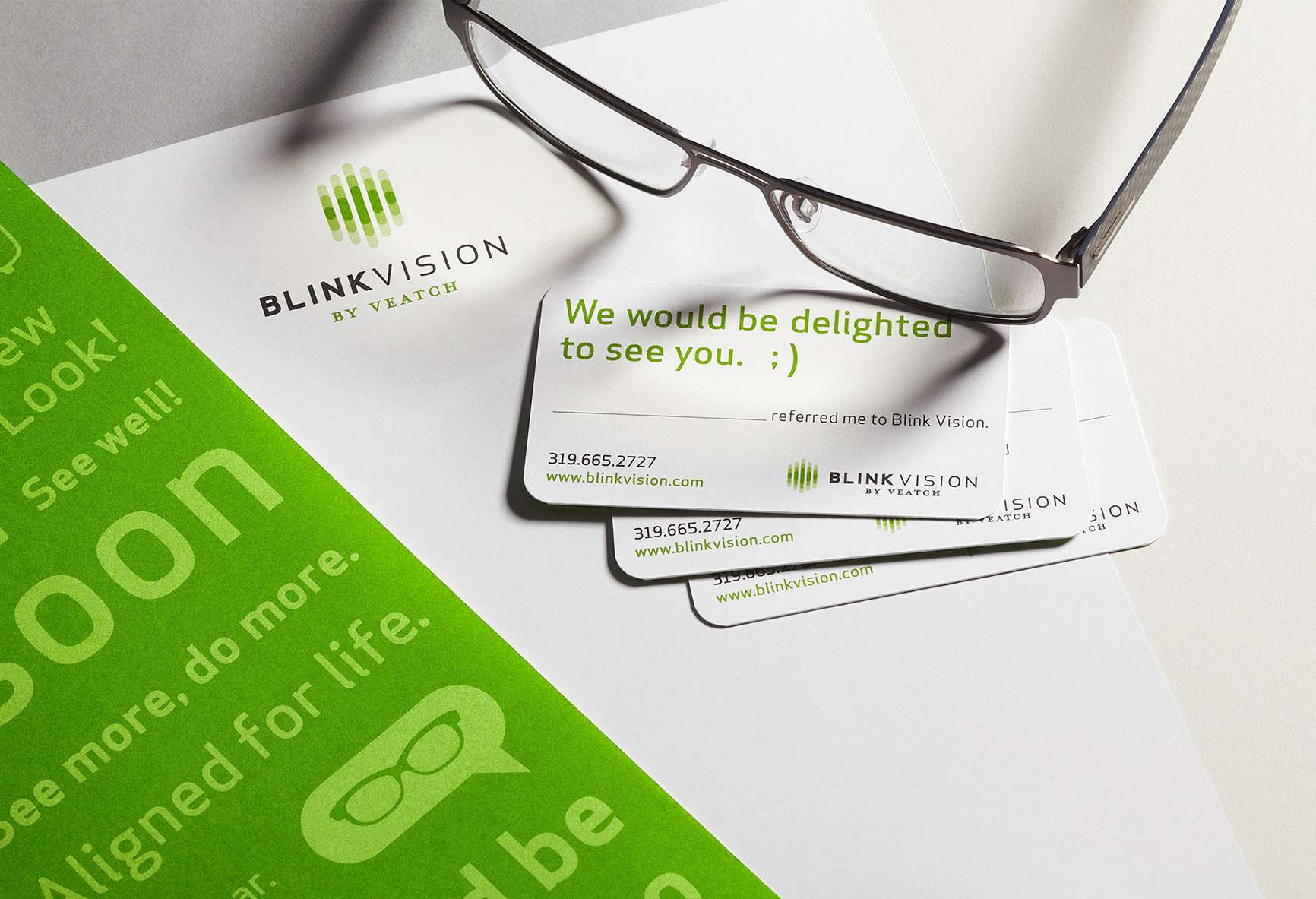
Collateral
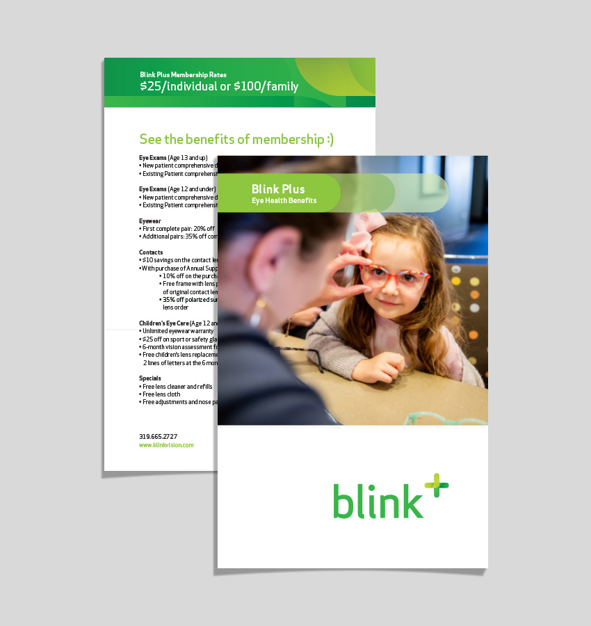
For patient-focused collateral, FUEL designers used rounded graphical end points to tie back to the logo. The simple color palette was used to contrast imagery for emphasis, while conversational patterns work hand-in-hand with headlines in playful executions.
Promotion
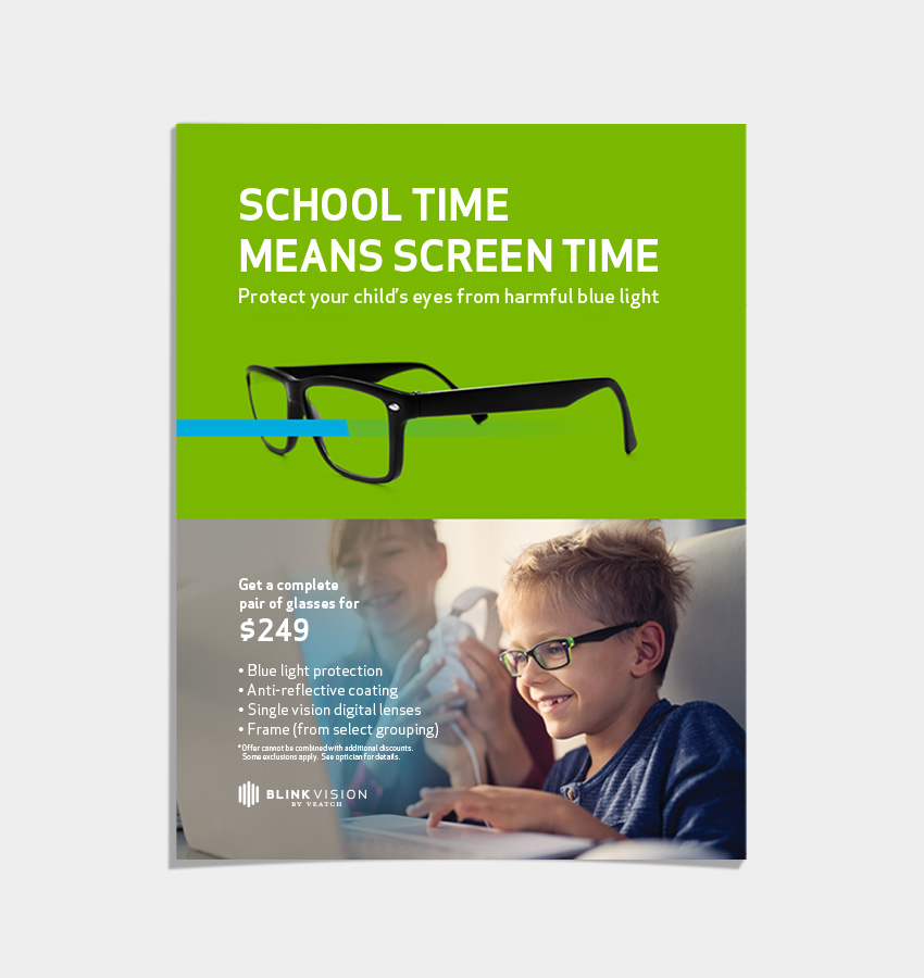
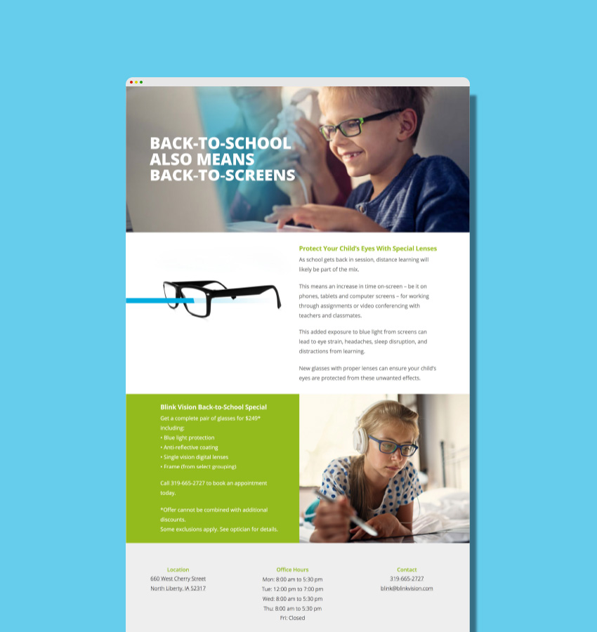
At some point, you must sell. And FUEL utilized engaging and informative materials to drive patients to online experiences for key periods of time like Back-to-School and Frame Fest which unveiled the latest frame designs.
Social
The brand strategy was carried through to social media to create consistency across digital touchpoints.
Web Design
Websites are living things and the current evolution reflects a streamlined approach to its UX. It was built upon the WordPress content management system to bring future flexibility to the build. Visually, the current site maintains green as a dominant color, but sets it against a warmer neutral canvas to further Blink’s connection between patients and extraordinary service.