After extensive market research, Tanager Place realized it was facing some major challenges. First, there was a misconception about its services. Second, its name and logo were conflicting with the overall mission. And third, sub-brands had begun to overshadow the master brand. With programs focusing on prevention, treatment and outreach, the organization serves over 4,000 children, young adults, and families per year from of all walks of life. FUEL got to work on enhancements to clean up these misconceptions about the client’s services, improve perceptions, and set the organization on a path for growth.
Brand Strategy
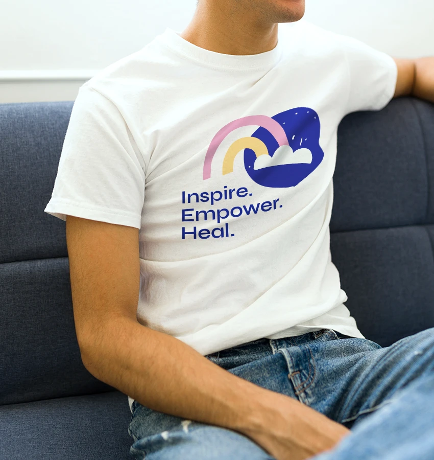
As our complicated world has increased the need for mental health services, it’s also highlighted the need to lessen the negative stigmas surrounding mental well-being. Tanager enhances the lives of children, young adults, and families through prevention, treatment, and outreach services to empower each to lead rewarding lives. It all boiled down to three words:
Inspire.
Empower.
Heal.
Brand Identity
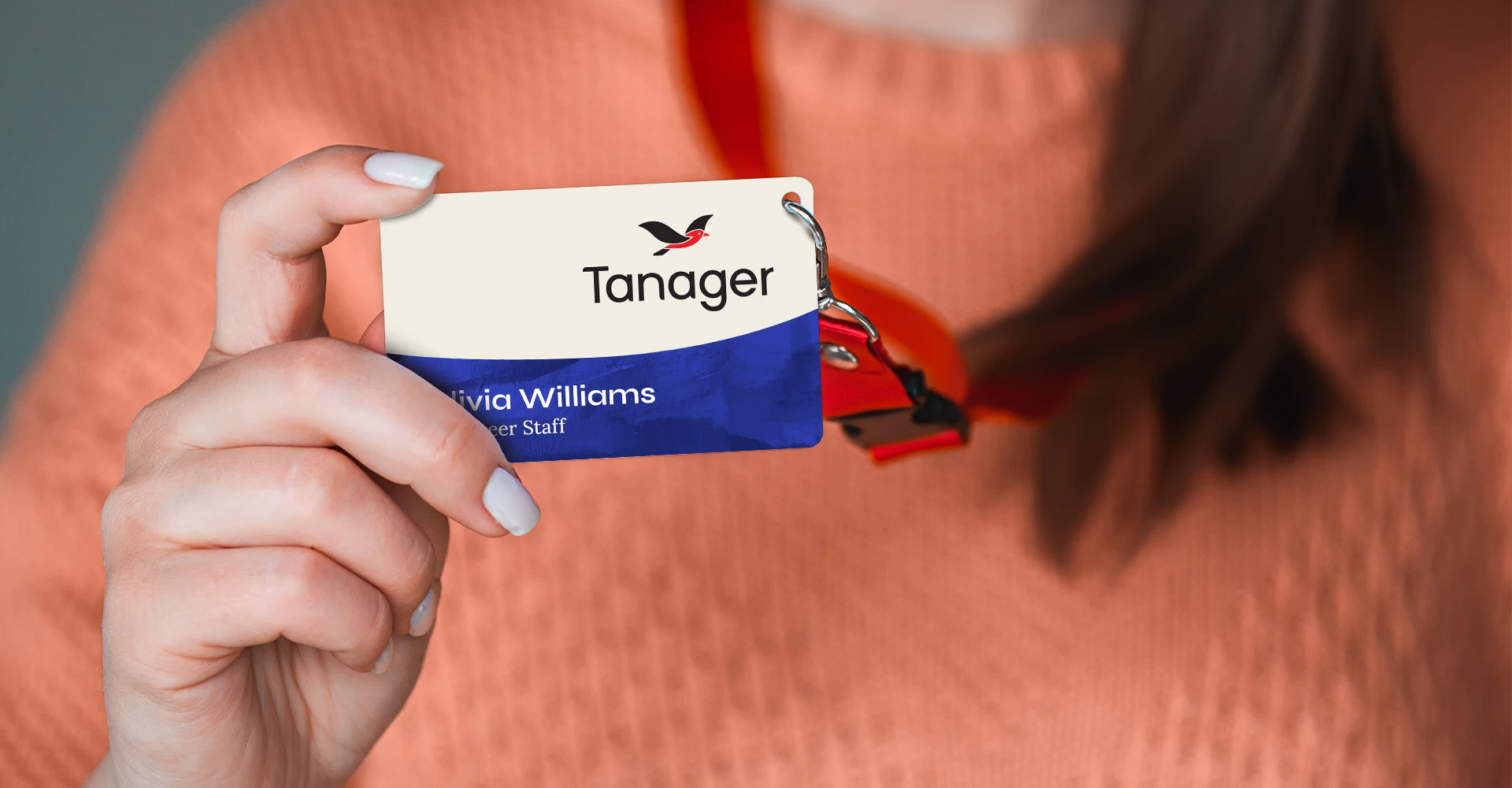
What’s in a name? Tanager Place was over 130+ years old and the tanager bird, long a symbol for new beginnings, was often seen residing on the property. However, “Place” felt tied more closely to the real estate and Tanager was already the established shorthand name around town. Our approach to refreshing the identity: build upon the strengths while expanding positivity.
By eliminating some elements from the existing logo, the new mark was able to put the emphasis squarely where it needed to be.
Before
After
Brand Expression
The Brand Expression highlights human connection wherever possible. Given the sensitivity around privacy, it’s not always possible to show imagery of actual people. Conceptual illustrations offered both versatility and a little pacing to the visuals while adding positivity and enriching the overall palette.
Since Tanager works with children and their development, we wanted the iconography to be playful and not so corporate. Wanted them to feel like they would resonate with a child’s imagination. We’re dealing with an intangible (i.e. feelings, etc.) and this was a great way to communicate these emotions.
For typography, FUEL selected Syne because it was a modern sans serif and felt approachable and refined. To compliment the sans serif, Lora is used because it felt appropriate given their storied history while not feeling detached from the modern world.
Color was a way to distinguish across the entire portfolio of offerings. We also were sensitive about choosing colors that felt positive in nature (e.g. we chose a brighter, more vibrant red for Tanager to replace the darker and dull red from the previous palette).
Web Design
Online, simplicity was the operative word. Tanager’s previous site felt complex and cumbersome. Related to this, the old site didn’t make it easy for people to reach out when they needed help. Built on the WordPress CMS platform, the UX led to a streamlined architecture representing the three key constituencies — Prevention, Treatment, and Outreach — so that people could easily find what they were after. And a call-out to the “Help Line” increased opportunities to help families in crisis.
Collateral
From apparel to I.D. badges, print ads to posters, the new identity and brand expression infused clarity and positivity into every touchpoint.