The Brief Can better maps lead to happier outcomes?
The Opportunity
RESCU3D is a California-based tech company that creates immersive 3D maps of facilities and trains first responders how to use them to resolve emergencies quickly. At the start of the relationship, the owner came to us with a home-grown logo and the name, “Infomapics”. FUEL helped him refine the company’s positioning, rename the company, and design a brand identity that would help this startup start strong.
Brand Strategy
In an emergency, every second counts. As part of its proprietary brand strategy process, FUEL helped the client tighten his presentation of the company’s what, how and why. It became clear there was more to the story than handing off the immersive 3D maps. He could also impart expertise through teaching first responders how to use them most effectively. This helped inform every detail that went into the building of the brand, starting with a new name.
Brand Identity
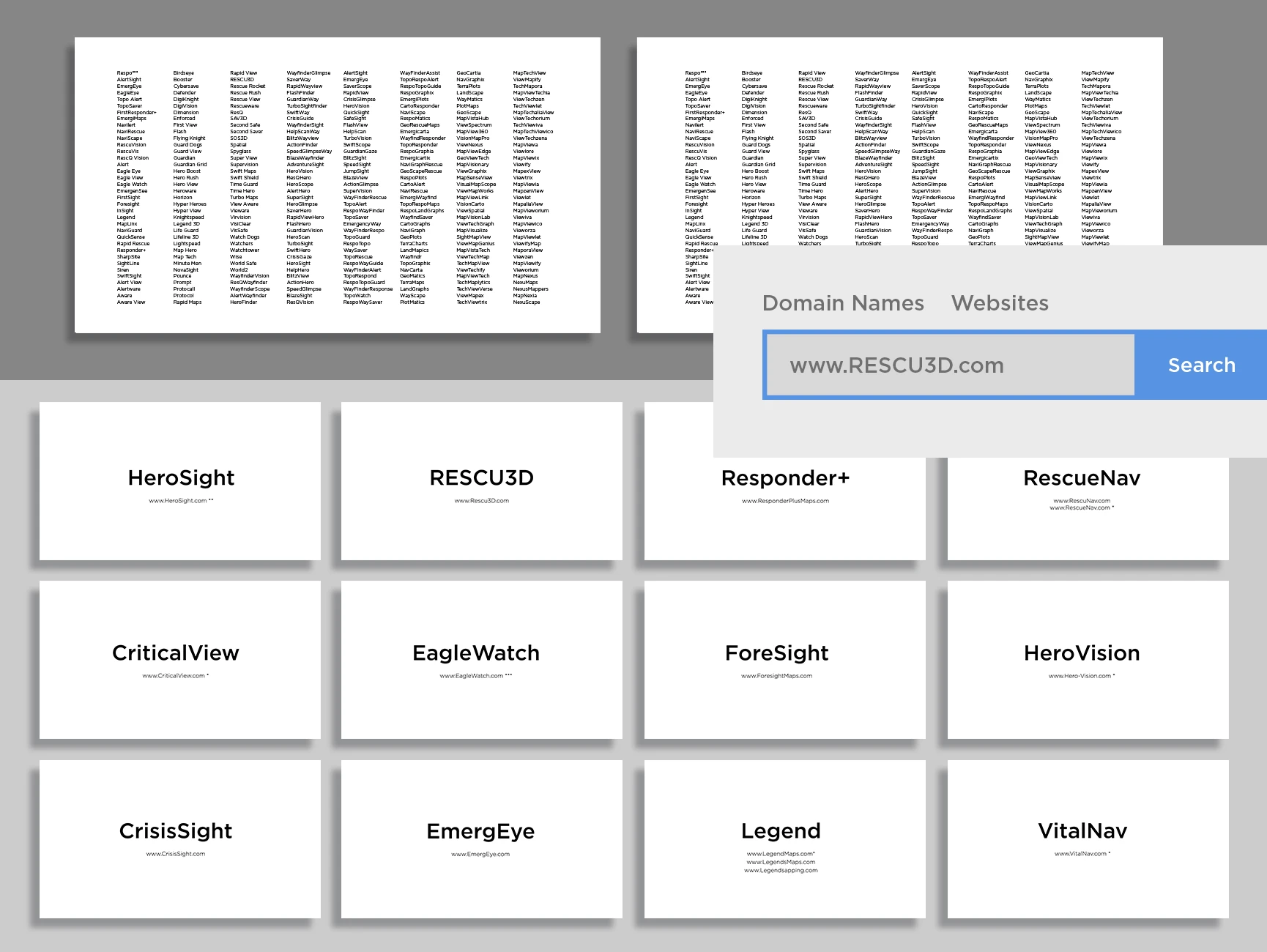
Currently, most in this market use outdated 2D floor plans. FUEL developed a range of names focused on the use of 3D immersive maps to assist first responders. By combining “Rescue” and “3D”, the name captures both ideas while also visually looking like, “RESCUED.”
When approaching any logo design, the FUEL team considers elements that are grounded in the authenticity of the brand. In this case, the mark is composed of three core elements: the “Shield,” representing Law Enforcement/First Responders; the “Eye,” representing the ability to see your surroundings and understand the layout of the building much more quickly; and the “Pin,” representing the immersive mapping technology that also serves as the iris of the eye.
Brand Expression
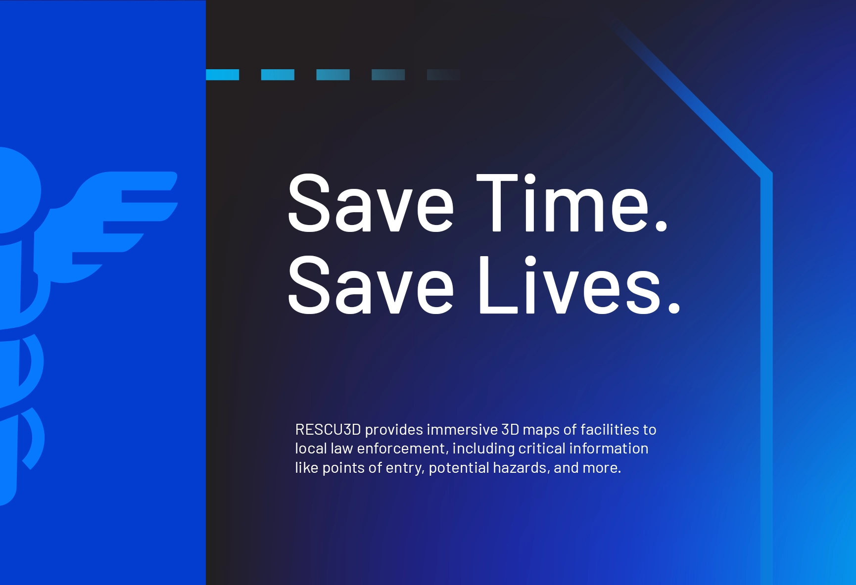
Rooted in blue, the color palette draws on visual cues from law enforcement and first responders. A gradient was used to add the element of speed and flexibility enabled by the RESCU3D technology. And Nightmode maps hit home the idea of technology-guided agility.
As for Tone of Voice, brand messaging speaks to the time sensitive nature of the subject matter, always reminding people the product helps to capitalize on precious time in those instances when every second counts.
Overall, the elements come together with a coordinated set of visuals to reflect the seriousness of the subject matter without getting gruesome or cheesy.
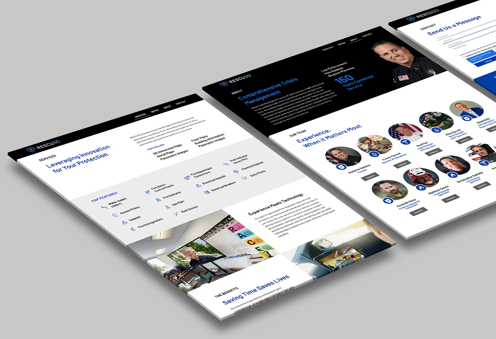
Web Design
FUEL helped the client update an existing one-page website to create more clarity when explaining his product with customers. At the time, too many prospective customers didn’t understand what the product did, and many left thinking it was some kind of Google Street View company.
This new user experience brought clarity to the company, especially with the help of a custom set of icons designed to align with brand expression while conveying details of the service.