Twin Shores
Brand Strategy / Brand Identity / Brand Expression / Collateral / Apparel / Web Design / Social Media / Photography
Broadening Niche
The Brief
Helping this focused builder grow by diversifying into new markets.
The Opportunity

Most FUEL clients need help honing a strategy to focus their business. Twin Shores had the opposite challenge. They were already very well known throughout the country as the go-to commercial construction and development company for movie theaters and family entertainment complexes. Growth would likely come from projects outside of that niche, namely the ultra-competitive private and public market segments like education, healthcare, and industrial. With that in mind, we began to broaden the brand strategy and design the diverse of range touch points required to achieve their goal.

Fuel employee writing on white board

Brand Strategy

Twin Shores is a multidisciplinary commercial construction and development company; it’s equal parts architect, designer, and builder. To help attract both clients and top talent, the strategy zeroed in on how its clarity, relationships, and acumen in theaters and family entertainment extend to other market segments. And ultimately driving home, “We build trust.”

Brand Identity

Recognizing the benefits of a brand identity refresh, FUEL designers updated the monogram logo and adjusted the typographic lockup. By lessening the tension between these two elements, it improved both their balance and interaction. A modern blue color palette was selected, and a slightly beefier typeface was chosen to increase legibility and presence.
Twin Shores old logo

Before

After

Brand Expression

The updated brand expression draws inspiration from architectural lines and loosely ties back to blueprints. The connecting ribbon is riffing off their business model: Twin Shores is more than just a siloed group of architects or group of builders in isolation of each other but are instead a collaborative team, “where ideas meet.”
Twin Shores exterior signage

Marketing/Collateral

The branding was brought to life through a new stationery system and a range of collateral and marketing materials, as well as environmental graphics throughout the home office and jobsite signage.

Twin Shores notebooks
Twin Shores jobsite sign

Uniforms and Apparel Design

FUEL helped design a thoughtful collection of uniforms and work apparel to let Twin Shores staff bring the new identity to jobsites and beyond.
Twin Shores apparel and construction hat

Web Design

When FUEL started tackling the company’s website design, it was recognizable that the current version felt uninvitingly dark and outdated. FUEL designers wanted to refresh the site so that it conveyed their work as leading the industry in design and architecture.

This would place an emphasis on rich photography, in-depth case studies, and client testimonials relevant to their project. In addition, the team found ways to integrate the illustrations, angled patterns, iconography, and even a few moments of customized typography, i.e., “Up”.

Twin Shores web pages
The site architecture and related SEO was organized to bring forth the broader range of capabilities and markets served beyond theaters and entertainment complexes, while showing proof of work through case studies for each.

Social Media

To help elevate the company’s image on social media, FUEL helped to plus up the company’s presence on LinkedIn, the popular professional networking app. This started with image selection and copywriting for the company’s profile page and extended into the individual profiles of members of the executive team to bring consistency and polish across the enterprise.

Photography

Photography was art-directed and captured by FUEL with a focus on the architectural elements and details inherent to each project while echoing many of the angular and linear cues in the brand expression. The team also paid close attention to the lighting and vibrant colors representative of each build, while also emphasizing the design touches relating to textiles, materials, and finishes.
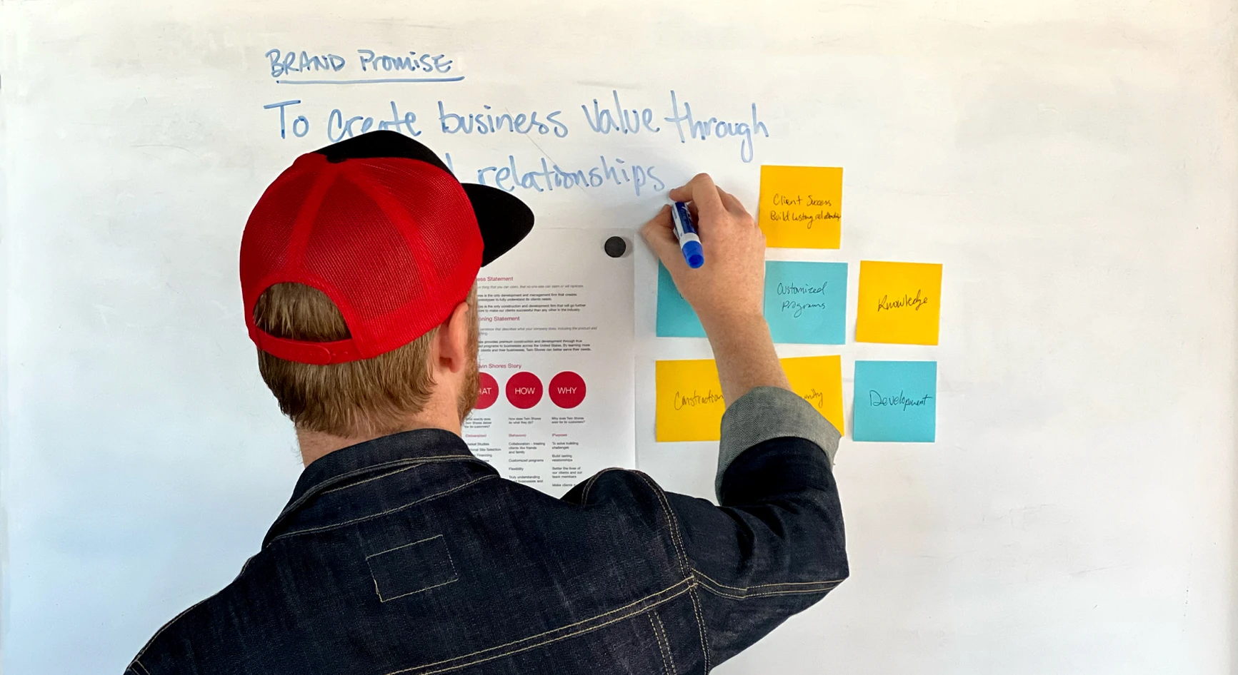
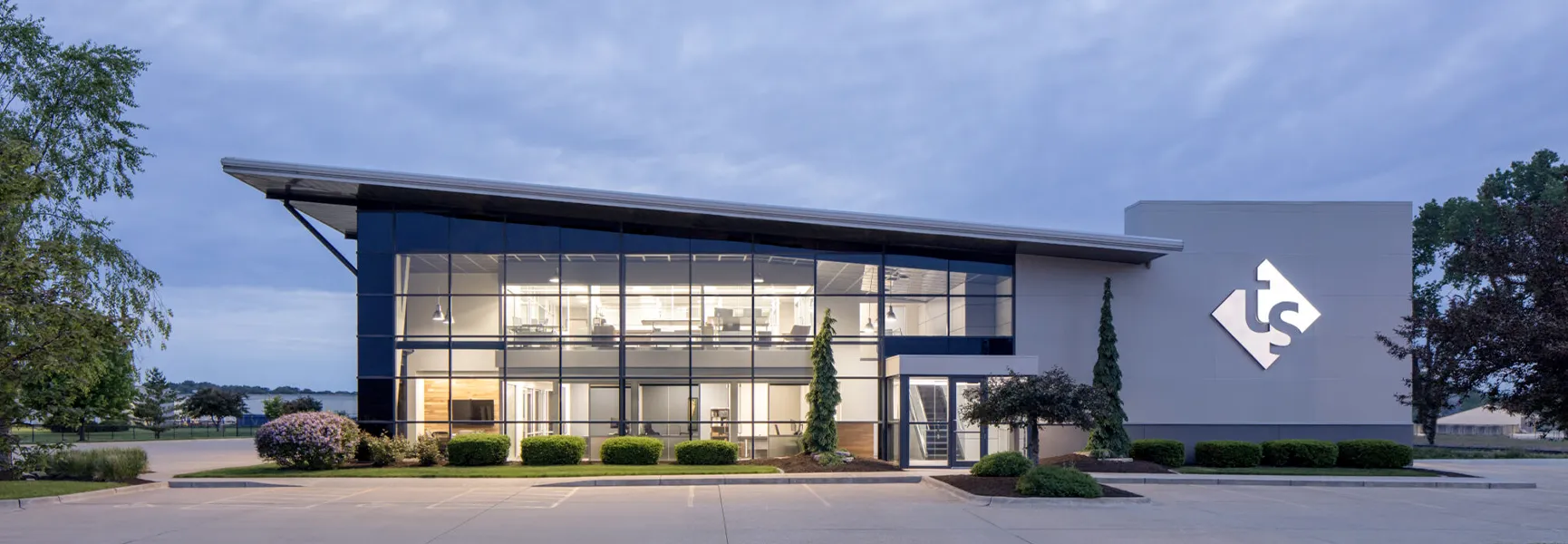
To assemble this vibrant library of visual assets, FUEL documented projects all over the country. This meant great consideration was given to capturing the settings and landscapes unique to each site, while at the same time ensuring a consistent look and feel from one location to the next.